CLEON PETERSON

Cleon Peterson was born in Seattle in 1973. That’s perhaps where the boring bit begins and ends. Raised in an open, intellectual and creative family (it was the ’70s after all), young Cleon rode skateboards and read comic books in between home-school assignments from his grandfather. This inspired guidance may have helped to foster careers for the two boys—Peterson’s brother is photographer Leigh Ledare, known for his series of provocative photos of their mother, Tina, titled, “Pretend You’re Actually Alive.” Cleon is featured in a few of Ledare’s portraits as well, as the family served as Leigh’s preferably taboo subject matter at the beginning of his burgeoning fine art career. Unfortunately, this was also during a time of personal strife for Cleon, who was wrestling with drug addiction, a diagnosis of mental illness and a severe asthmatic condition causing him to be deathly allergic to oil paint (and cats).

However, Peterson rewrites his story and it begins again. He has made the incredible journey of overcoming these impossible obstacles and is thriving, using his past experiences to inform and develop his amazing talent for design and art. Peterson went on to receive a BFA from Art Center College of Design in Pasadena and an MFA from Cranbrook Academy of Art in Detroit. He currently lives in Los Angeles with his wife and kids. When he’s not painting in his studio, he works as a freelance graphic designer. Peterson has shown at New Image Art in Los Angeles, Alice Gallery in Brussels, Lazarides in London, Joshua Liner Gallery and Deitch Projects in New York.

With all his hard-earned success, he can see things from the other side now; however, his view is not necessarily pretty upon closer inspection.

Stripped down to the most concise visual information he can offer you, Peterson’s paintings portray only slightly ironic nightmares born from years of personal struggle, street violence and ultimate survival. There is no escape from Cleon Peterson’s work and his exorcised demons, which sometimes wear uniforms or just underpants. His narrative is dark and uncomfortable, a car wreck you can’t look away from. The canvases provide a catharsis for the painter and, depending on individual experience, his audience.


Cleon Peterson SI #1


Peterson’s street fighters remind us there are sinister, very personal ways to die by knife, stick, fist or claw. Rarely will you see a gun. This is absurd, graphic violation in spot color—the flat fields of red, black and white contribute to the anxiety, the rawness and the inescapability of the static chaos in his compositions.

The faceless, generic violence that Peterson depicts is at its most frightening in that it lends itself to any neighborhood, any ethnicity, any gender. Anyone in Anytown, USA. It’s Dante’s Inferno depicted for a modern age. Heavily influenced by comic masters Dan Clowes, Charles Burns and Robert Crumb, as well as his own unwavering ability to design the hell out of a blank page, Peterson’s quality of line and perspective drawing is flawless. He provides beautifully rendered street corners at alternative angles and battlefields viewed from above for his imaginary urban territories, even if the society he’s depicting is massively askew.


RETURN TO THE HOME PAGE

VISIT CITIZENSOFHUMANITY.COM

PETE THOMPSON

How did you get into photography?

My grandmother. She was fairly unique in the way she looked at the world. She bought me my first camera when I was probably around 12. Then, from there, I was mostly shooting skateboarding, which led me to the first part of my career, working for Transworld. I was a sponsored amateur and so most of my friends were pretty good skateboarders. I was living in Raleigh at the time and was sort of the only guy photographing.

What was it about photography as a medium that interested you?

Initially, I feel like it was just mostly the passion for documenting skateboarding that started things out. As my career developed, I was driven to be more creative with it, which was a bit of a confusing place to be, because a big part of shooting skateboarding is about showing what’s happening in a way that the trick that your shooting can be measured and evaluated. It’s also a real challenge to be creative when you have very little time and are constantly getting harassed by cops and security guards. After I stopped shooting skateboarding, it took a while to step away from that mindset and reconnect with what I truly loved about photography, which is capturing a moment that speaks to me. Sometimes, that moment is a reflection of how I feel about the subject and other times its about capturing someone or something in a truly authentic moment of its own. It’s a bit like a conversation. At times you step back and listen to what someone is saying and try to understand how they feel, and sometimes you speak and express how you feel. Hopefully, whoever is looking at the picture can share in that truth.

When did you move to NYC and what prompted the move?

I moved to New York City on November 19th 2008. Anyone who has come to New York remembers the exact date. I was living in San Francisco at the time, and I was just kind of wandering in the world of photography odd gigs here and there, not really sure what I wanted to do. Then I was at a wedding for a friend of mine, and I met Paul Gilmore who convinced me to come stay with him in Brooklyn and check things out.

The lessons you learn from surviving in New York City are lessons that you can’t really get anywhere else. New York forces you to take a hard, honest look at yourself and then everything gets thrown at you. New York doesn’t care about you, your problems or your excuses, and so you really have to tread water till you figure things out. However, if you can dig deep and survive, then the City can become like a friend (that has occasional tantrums).

What were your first thoughts when you moved?

My first thought right when the cab dropped me off from JFK was “umm, I think I fucked up.

What are your favorite aspects of the City?

The energy, it just can’t be overstated. There’s no other reason why I can be somewhere far away, on a beach in the sun in the middle of January and at the same time feel  the need to get back home.

Who are some of your artistic heroes?

Stanley Kubrick, Bruce Weber, Peter Lindbergh, Terrance Malik, Paul Thomas Anderson, Phillip Seymour Hoffman, Muhammad Ali, Marvin Gaye, Aretha Franklin, Maya Angelou, Richard Avedon, Milos Forman, John Lennon, ThomYorke.


Pete Thompson SI #1


What are your favorite places to shoot/work?

I really like shooting on location. It’s obviously much more challenging than working in a studio, which is something, I learned when I was working as an assistant for Anders Overgaard. But, it is far more rewarding and can be much more organic in telling a story when you give an image a sense of place. Cape Town is unreal; it has so much to offer in terms of landscape. Northern California is amazing too.

What are your favorite places to relax?

That’s a bit tricky. I have a hard time relaxing, ha! I think if I’m with my family/friends in SF or DC, then I’m usually pretty content. Somewhere quiet, where I can have one-on-one conversations.

Is there anywhere you want to go, but haven’t been?

I’ve been all around the U.S., but I’ve actually never been to New Orleans. I wish I had gone there before the hurricane, I’d also love to go to Cuba. Iceland is also on my list.

Where do you like to spend down time?

When I’m in New York City, I like to hang in my hood (Carroll Gardens). It’s quiet, peaceful. There are great restaurants, and its low key. So, I hang out around home quite a bit when I’m not working.

What’s a good day for you?

Sometimes it’s a day when I’m shooting and everyone on set is enjoying what they do and the vibe is just right, creativity is in motion. And, it’s beautiful outside. Other times, it’s just a day when I wake up, the sun is out, and I’ll listen to NPR, and step outside for coffee, meet a friend and have a good conversation.

What should anyone who visits New York City do while they are here? Do you have a guide for taking in the city?

Well, the main thing that I would suggest is to just wander around. Each corner of New York is so different from the rest. There is no other city like New York; its the ultimate laboratory. It’s the first place that people from all over the world came to inhabit together. The history of New York is fascinating and the energy is seductive. I would try to grab a few slices. I recommend, Grimaldis and Lucalis are my favorites (both in Brooklyn).

But, the main thing is to just go explore and avoid Times Square at all possible costs.


Pete Thompson SI #7


What is the best advice you ever received?

One lesson I learned from skateboarding is that when you fail, you have to get back up and try it again and again… and that your own particular style is what sets you apart from others.

What is your best advice for someone who hopes to find a career in the arts?

It won’t be easy. Finding your own way is very challenging, and you will have to make considerable sacrifices, but ultimately you have to be still and listen to what your heart tells you. You have to keep moving forward, keep evolving, and accept that it’s not something you can just rush through.

It’s a long road, and there will be periods when you think your just wasting your time. But, you have to just keep going and believing in whatever it is you do. Don’t compare yourself to anyone, and surround yourself with people who share your passion to create and think.

Take time to develop yourself. And, really get to know who you are; that’s crucial. I think part of being successful is also understanding and developing the skill of looking at what you do from other people’s perspectives which can help you find a way to make a living doing what you love. And, don’t make big decisions based on money or fear.

Are there any specific words you try to live by?

Always do your best, and treat people with respect.

How do you define success?

Doing what you love, and understanding who you are.


RETURN TO THE HOME PAGE

VISIT CITIZENSOFHUMANITY.COM

ED RUSCHA

Traveling through Tennessee recently, I could still see the impression legend Clark Byers’ hand-painted SEE ROCK CITY signs have left behind. Some are vinyl knockoffs, but some of the original boards remain, acknowledging the lost Americana art that has suffered against modern printing technology and the bombardment of digital advertising. Artist ED RUSCHA has fond memories of these signs, just as America does for the many similar ones that adorned big businesses and small communities around the country for generations. Ruscha was inspired, and there’s no doubt his body of word paintings are a close relative to the hand-painted sign—his necessity being to communicate an idea rather than something for sale. Of course, art is for sale, so there are comparisons on many conceptual levels. The message is in the hand-painted letters nonetheless. In the 1980s the advent of precise die-cut vinyl lettering and ink-jet printers made the art of necessity cheaper and quicker, but the beauty of the hand-painted symbol has survived. The magic of a hand-painted sign isn’t just in the eye of the beholder; it really lies in the hand of the painter. The perfect brush to pull a line, the optical illusion of letter size, the planned spacing for the optimum read—all these techniques are unique and can’t be replicated by any machine. The human craft of creating one-of-a-kind signage is historic, and though the experienced sign-painter journeyman may be fewer and farther between, the art is alive and well thanks to a resurgence recently in art galleries, books and even as the subject of documentary film. Sign painting is not a science; it’s simply an amazing way to use color and paint to build up letters and words on metal or wood, and it speaks directly to you. Ed Ruscha, like many artists, recognizes this beauty. I was fortunate to have a conversation with him about the art of the hand-painted sign.

What are your earliest memories of seeing hand-painted signs?

I watched a heavyset man squat before a sheet of metal and hand-letter the complete menu for a drive-in hamburger stand in Oklahoma City. He was quick, facile and had everything preplanned. Another time I watched a man do gold-leaf lettering on the translucent glass of my dad’s office door à la Sam Spade. It was for the Hartford Insurance Company.

What attracted you to their craftsmanship?

It was all showmanship, and neither man was distracted by observers. One used matchsticks and toothpicks to correct over painting, while the other used a comb run through his hair for static electricity. These guys were artists!

You had an early interest in typeface in your fine arts career. How did that originate and how did it develop into a fascination with language?

Walking past a bakery always gets the good sniff responses, but in my case it was the aroma of printers’ ink. Especially freshly printed material. It was only a matter of time before I noticed the difference between typefaces.

Do you consider yourself to be a typographer (or a sign painter) since so many of your pieces contain words as the primary subject?

Anyone who makes pictures of words is doing so as though they are carving that word in marble, to make that word solid and last forever. It’s like making a word final and official.


Los Angeles didn’t really have a sign-painting movement like San Francisco or NYC. It really developed here later. We had more neon, oil-based and plastic signs. Do you think there is a connection between sign painting and pinstriping and that could’ve influenced the movement in Los Angeles?

The custom-car culture of Southern California used paintbrush features associated with sign painting, such as pinstriping and embellishments. This set L.A. apart from other sophisticated centers like New York, Chicago and San Francisco.

What is it about the casual look of hand-painted letters that is more appealing than corporate logos?

Handmade letters are more compelling because they are just that: handmade. They call back to the individual rather than a refinement of an industrial idea.

How is the art of optical illusion used in sign painting and why is it important?

Many tricks and devices are used, and in sign painting, these novelties are necessary and, as most sign guys say, “to catch the eye.”

How and why did you adapt that technique in your own artwork?

It’s only coincidental that I lay paint on a surface with a brush like a sign painter. Sign painters might be more “correct” than me since my stuff might be more cerebral.

How does sign painting use color as a necessity?

Again, it’s like that “to catch the eye” concept.

How do you implement your choice of what graphics (ground) vs. graphics (typographic) you use in your word paintings? Do you think that decision is inspired from a sign-painting perspective?

All of us use the ground/subject format. I think about these oldtimers using one-stroke show-card lettering. They get results I envy for.

Is graffiti related to sign painting? How so?

For urgency if not for commerce. These two things might be blood brothers.

How is the psychology of sign painting (in terms of having a very specific purpose) related to the concepts in your word paintings? Is there a connection?

My painting may not sell hamburgers, but I’m aiming for the same high ideals.

Do you have a favorite memory of a hand-painted sign that you really appreciate?

Yes, there was one on the back of a truck in Chickasha, Oklahoma, that said “MELNS 25 CENTS” sitting against a bed full of freshly picked Jubilee melons.

What do you think you would you have done if you weren’t Ed Ruscha the artist?

I would have been Ed Ruscha the meteorologist.


RETURN TO THE HOME PAGE

VISIT CITIZENSOFHUMANITY.COM


DEREK RIDGERS

Though he’s captured frames of some of the most iconic performers, artists, politicians and even gangsters, it was snapping through rolls of film in London’s club scene in the ’70s and ’80s that established Derek Ridgers as a talented photographer. Ridgers was already in his late 20s when he trekked out to Skin Two, The Blitz and other London venues where British youth were rebelling and reacting to the right-wing agenda ushered in by Prime Minister Margaret Thatcher, with brash fashion steeped in fetish and the extremes of underground culture.

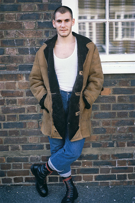
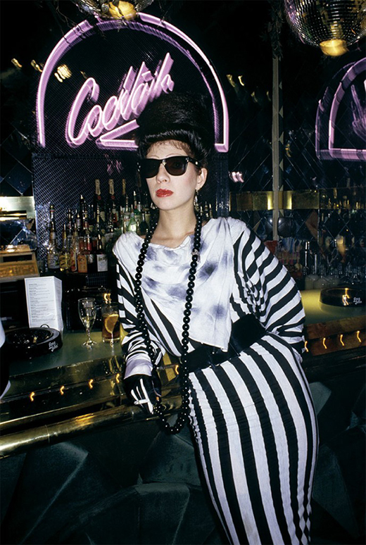
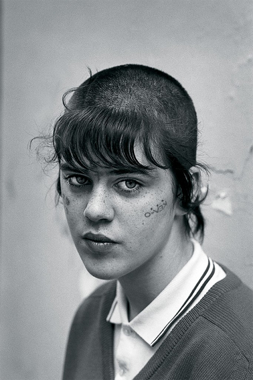
The youth Ridgers caught on film were stretching the boundaries of convention, sporting tattoos on their faces, necks and hands—something that wasn’t only taboo but often dangerous to have etched on your skin in public. Skinheads, new romantics, punks, goths and every other subsect of youth culture were commingling, with a total disregard for societal boundaries. It was ripe for documentation, and that decade has now been illustrated in a rich monograph titled 78-87 London Youth, in which Ridgers’ images and John Maybury’s text tell the story of the evolution, punch and panache of the disenfranchised and the historic scenes they inhabited. 


Derek Ridgers SI #1


How did you first get interested in photographing club kids, and were you met with any resistance initially?

Back in the 1970s, I was an advertising agency art director with easy access to a camera. By night I was a keen music fan and I started taking a camera to gigs, forcing my way to the front, pretending to be a photographer and shooting photos of some of the bands I liked.

In the beginning, it was simply an excuse to get a bit closer to the musicians themselves. But eventually I started to quite enjoy looking at the results as well.

Then in 1976, punk happened.

One really would’ve had to have been blind not to see how photogenic the punks were. So I turned the attention of my camera around and began to photograph the audience at the punk shows as well as the bands.

I really never had much resistance from any of the kids I was photographing. Maybe because I was keen on portraiture rather than reportage, I usually used to ask people first and if they declined, I’d just move on.

The only exception to that was in the early fetish club Skin Two. Most of the punkers didn’t want me there because they wanted to keep their fetishism private and they didn’t think outsiders should be around, let alone outsiders with a camera. Which is fair enough. I had a few of them offer me physical violence a few times—I remember one guy grabbed me by the throat. But my charm eventually won through. Plus, I’m quite a big bloke to be grabbing by the throat.

I used to get left waiting on the pavement for a long time by [Visage frontman] Steve Strange at The Blitz Club too. Steve Strange was already a legend in his own mind, even before anyone had heard of him, but having people wait out in the cold was all part of his shtick. But I’ve found you get nowhere in life if you take “no” for an answer. I simply wore Steve down with my persistence.

Can you explain the shock value of seeing kids with face, neck and hand tattoos back then?

I think that back then kids that chose very visible, very antisocial tattoos felt themselves to be ostracized by society and they were expressing themselves in one of the only ways they had. By getting themselves tattooed in that way they were saying, “I know I’m never going to be a conventional member of the society like you, and I don’t want to be.”

There was another, darker side to it as well. Most of the facial tattoos were done by unlicensed backstreet “scratchers,” and the majority of them in London were done by one man who, for a few cans of lager, would tattoo pretty much anything on anyone—provided you were young and male. Happily, I never met this guy, but I reckon an element of coercion could have been involved. Recently a guy that was subject to just such a facial tattoo from a scratcher—not sure if it was that particular guy—described the experience as being like a 30-year sentence.

He’s now hoping to get it removed.

At that time, the only people to have very visible, antisocial tattoos were people at the margins of social acceptability. Bikers, skinheads, teddy boys, prostitutes, rent boys, etc. I photographed all of them and never found approaching any of them difficult, but one does have to pick the right time, be polite and avoid being patronizing. If you have a big macho guy who’s in a bike gang, for instance, they are used to people looking away when crossing the street. They expect to be able to intimidate people. They don’t expect to be approached with an open mind and a friendly manner. Then my camera and its proximity often intimidates them and you get to see the real character. Often there is a real vulnerability in faces like that. They might take on a dozen men in a bar fight but they don’t always feel so comfortable with the close scrutiny of a camera.


Derek Ridgers SI #2


What do you think was happening in England that spawned so many flamboyant and over-the-top looks then?

It wasn’t really what was happening culturally but politically. The key event of this time period was the election of the Thatcher government in 1979 and the circumstances that allowed such a cynical, right-wing government to take power. Margaret Thatcher had a very anti-trade-union, anti-working-class agenda, and a lot of the teenagers from that time didn’t think they would ever get a decent job and so they had very little to look forward to. I think their fairly understandable response to having, quote, “no future,” was that they may as well try to have fun whilst they were still young.

There was a tremendous flowering of young creativity under Thatcher which I don’t think we’ve ever quite seen since. Though unfortunately the country is still suffering from a lot of the rightwing policies she started—like the selling off of Council housing and the selling off of publicly owned assets. I was not a fan of Margaret Thatcher. Not by a long chalk.

What were you mainly shooting with for the photographs in the book and what were the challenges shooting in club settings?

Throughout the period I was taking the photos in the book I used a small SLR Nikon. First, a secondhand Nikkormat and eventually a Nikon FM. I used either a 50 mm or 24 mm lens, and I used a small and very underpowered flashgun, which I had mounted on a contraption I had made from a bent coat hanger. The purpose of the unconventional flash bracket was to get the source of light as close to the lens as possible and therefore reduce the effect of shadows.

Around 1984, I fell asleep on the train one night, on my way home from a club, and had the first camera and very unconventional bracket stolen. I simply reproduced it a second time, but the second version was never quite as good as the first. I used this wacky bracket that was covered in Sellotape right up until I started using digital cameras in 2004. I never once saw anyone else use that idea. I’m not sure if that means it was a bad idea? The big challenge to shooting in clubs is that it can often be very noisy, very dark and it can be very, very crowded. This aspect isn’t always obvious from my photos. This is why an awful lot of my photos are taken in corridors and stairwells. That was the only place I could see, make myself heard and stand far enough back from my subject to get them all in frame.

There’s a sharp contrast between punk now and even what Malcolm McLaren was selling as punk in the ’70s and what the average kids are seen looking like in your book. Can you explain the difference?

With the exception of the Malcolm McLaren/Vivienne Westwood stuff and a few items from BOY, the original punks only really had clothes they had made or adapted themselves. I shot extensively in the original London punk club—The Roxy—and there was a lot of augmented school uniforms, painted leather, stencil work and bin-bag clothing. The mass-market punk clothing from places like Miss Selfridge didn’t come until later. But not much later.

A lot of the multinational brands had wholeheartedly jumped on the punk bandwagon by the end of ’77. Which for the original punks, spoilt things somewhat. That was why a lot of them then rejected the punk look and went for what was, in many respects its antithesis. The new romantics and their high fashion and overdressed approach, which started the following year, was initiated almost completely by ex-punks.

Back then I don’t think the various youth cults you mention were seen as being a part of the overall fashion scene. That they were almost all quickly subsumed by the requirements of big fashion chains, that have to have something brand-new to sell each season, was not a surprise. But I was surprised by the speed that it happened. In ’77-’78 I worked close to Oxford Street and I saw the punk styles appear very quickly in Miss Selfridge. Even before punk had rolled out to some of the less hip provinces.

Nowadays the fact that so many aspects and styles of the past have become present-day fashion memes is to do with commercialism and nostalgia. And I suppose partly that some of those things, like the leather jackets of the bikers and rockers or the Dr. Marten boots of the skinheads or the parkas of the mods, always were destined to become design classics. A lot of the brands that were associated with the various youth styles are always going to endure because their qualities were intrinsic.

Who were you photographing back then that eventually became famous and did you see that “star power” in them?

The most famous of them all was Boy George, who for a while in the mid-’80s must have been as famous as anyone anywhere ever. I certainly did not think he had any star power before he was famous and he just struck me as quite a friendly bloke with a lot to say for himself. Everyone thought of themselves as being at the bottom of a certain trajectory and only a few of them were correct in that assumption. Quite a few of my photographic subjects went on to become pop stars for a while [Siobhan from Bananarama is also in the book], and in every case, you could have knocked me down with a feather if you’d told me they would achieve fame.

I was at art school with Freddy Mercury [then Bulsara], and we were friendly. It was the same with him. A guy less likely to achieve worldwide fame I couldn’t have imagined. Maybe I’m just no good at picking them?

I’d rather not pick a favorite, but what I would say is that there were some exceptional women around then. Myra Falconer, who is in the book twice, had a very unconventional beauty but I’d rather shoot her any day than a conventional beauty. And that’s not supposed to be a backhanded insult either—she always looked sensational.

What one image captures the title 78-87 London Youth to you and why?

Well I didn’t make the choice of what photographs were used in the book and I also didn’t make the choice for the cover photograph. Never in a million years would I have chosen that image to go on the cover of my book. But in retrospect I think it was a very good choice, and this factor shows why I am not a book designer. Kudos there to the books designer Rupert Smyth. So for one image that captures the title London Youth it would have to be that one.

But if you asked me to say which is my favorite image, it would definitely be the last one inside the book—the skinhead girl Babs, shot close to Carnaby Street in 1987. She was such a beautiful young woman with such sad, expressive eyes. And with the back-to-front tattoo on her cheek, I guess she was very mixed up and probably a rather troubled soul. I’m fairly sure she was a troubled soul because I have other photos of her taken in ’84 and she had her whole life roughly sketched out in an amateurish way on her arms.

I haven’t seen her since the day I took the photograph and I sincerely hope she’s had a happy and productive life. The look in her eyes is one that can bring me to tears. That’s why it’s my favorite.


Derek Ridgers SI #3


RETURN TO THE HOME PAGE

VISIT CITIZENSOFHUMANITY.COM

FRANCESCO CLEMENTE

Francesco Clemente is stark and intimidating, not unlike his artwork. He speaks carefully and briefly, without a sign of chattiness or informality. Clemente’s wide-ranging works of the 1980s, often centering on stark, confrontational representations of the human body, defied much of the abstraction in favor for the previous decade. His painted imagery could simultaneously evoke sexuality and religious allegory, with portrait subjects staring the viewer squarely in the face. Born in Naples in 1952, Clemente moved to Rome in 1970 to study architecture at the University of Rome. He soon began to work as a visual artist, and at age 24, he met his future wife, Alba Primiceri. The couple soon had the first of their four children and moved to India. By the beginning of the 1980s, the couple and their children were in New York City, but Clemente returned frequently to India, completing his 24-work 1981 series “Francesco Clemente Pinxit” in collaboration with Indian artists trained in miniature painting.

In New York he became an art star, collaborating with the young Jean-Michel Basquiat and the older Andy Warhol. Clemente also created works in collaboration with or to accompany the works of poets Gregory Corso, Allen Ginsberg and Robert Creeley. Along with Alba, who was a frequent muse to and portrait subject of many of their renowned artist friends from Basquiat to Alex Katz, he would spend evenings at the great New York nightclubs of the 1980s: Danceteria, the Palladium and the Paradise Garage. Clemente never ceased traveling, however. He maintained homes and studios not only in New York but also in Rome; Taos, New Mexico; and Chennai, India. Today he and Alba live in a Greenwich Village home that belonged to Bob Dylan in the 1970s, and he maintains studios in Manhattan and Brooklyn. It is India, though, that has perhaps been the center of his creative energy for the longest. Having long collaborated with Indian craftspeople in connection with his art, Clemente continues to work alongside them in his most recent series of tents, which are sized to hold dozens of people standing within them and are densely painted and printed both inside and out. Evoking nomadic cultures around the world, the tents are made in India, each taking a year for Clemente and a team of Rajasthani woodblock-printing artists to create. They’re a spot-on metaphor for Clemente himself, the nomadic artist, ever wary of easy categorization, to set up an identity he can take down and take away anytime he chooses.

New York City’s Rubin Museum will present a show of 20 of Clemente’s India-inspired works in September of this year, and Mary Boone Gallery will present two new tents in November.

What was your childhood like in Italy?

I grew up in Naples, a city somehow broken but full of wit and cultural arrogance. My parents had modest means but managed every summer to travel by car to a different European country. By the time I was 12 they had taken me to see every monument or museum in Europe they could think of.

You briefly studied architecture in 1970. How did you end up becoming a painter?

The faculty of architecture in Rome was then the hotbed of anti-capitalist and anti-imperialist activism in Italy. There was much violence and turmoil and, to my eyes, opportunism. In an early catalog of my work I remember writing: “I am looking for a territory without enemies.”

What compelled you to want to share your thoughts and ideas through art?

I had an exaggerated awareness, from an early age, of the dynamics of power. All knowledge appeared to me a tool for domination and exploitation and hence a lie. I didn’t want to be part of the lie. To become an artist was the way out.

How did you come to collaborate with Basquiat and Warhol?

Bruno Bischofberger, who at the time was one of the few who had respect for both Warhol and Basquiat, suggested we make some works together. This was easily done. Our studios were close to each other. We were close, too. Warhol’s Interview magazine had covered my work only a month after my arrival to New York. Basquiat and I had common literary likes, particularly the Beat poets.

What was it about their work that you made a connection to?

I relate more easily to “big” art. By big I mean art that crosses its cultural context and aspires to express a worldview. Both Warhol and Basquiat, in different ways, shared this aspiration.

You have also worked with many poets. How has that medium inspired yours?

Yes, to use the words of John Wieners, I pray every morning, saying: “Poetry visit this house often.” Ginsberg, Creeley, Wieners continue to inspire me, not just with their words but also with their character.

When did you first travel to India and what sparked that desire?

The same motive forced me to become an artist and to travel to India. I was discontent with the boundaries of Western culture, the culture of want, of “I” and “mine,” a culture that claims to have defeated poverty, whereas it has made poor even the rich.

How did Indian culture begin to influence your work from that point on?

In India I learned my favorite prayer. It goes like this: Oh Lord protect this body, protect this mind, protect this intellect, protect this ego [three times]. I am not this body, I am not this mind, I am not this intellect, I am not this ego [three times].


Francesco Clemente SI #1


Francesco Clemente SI #2


How does your work relate to the artistic practices and traditions of various regions in India?

I am attracted to cultural contamination, to inclusive views, to rituals, to handmade things, to anonymity, to anything that looks worn by time, to anything that has a feel of poverty and nobility at the same time. I encounter many of these qualities as I roam across India.

In contrast to the conceptual art practices of the 1970s, why did you choose instead to include representation, narrative and the figure in your work?

I did not choose. I made room for a work to happen. The work manifested itself this way. Sociological concerns just don’t seem so important if you begin to listen to the troubling noises of mind and body. “Ready-made,” “appropriation” are excellent tools if you want to show what art is. I am more interested to show why art is; hence I paint and draw.

You have explored a variety of more traditional, artisanal materials and modes of working. Can you please share how that evolved for you and what those processes and materials are in your artwork?

The work mimics the fragmented state of the world. It mimics a world in flux, where the only constant is “the continuity of discontinuity.” Not only do my mediums change all the time but also the supporting surfaces of my paintings are never the same for long. By doing this I chase the ever-changing nature of our perception and aim at stripping it naked of conventional truths.

In 2013, you had an exhibition of tents, something different from your usual exhibitions of paintings. How did this come about?

I had spent time in China, and from China the world appears bigger than ever. I felt challenged to make larger, more public paintings, but I didn’t want to lose softness, vulnerability and sensuality of touch. These are the tents—they are enormous paintings you can touch, smell, sleep in.

The tents are all hand-painted, inside and out. How does that influence the experience the viewer has, even though they are inside a gallery setting?

The beautiful thing about handmade things is that they always make room for something unexpected to happen. In this case I had not anticipated that the painted walls of the tents were going to be viewed in a dim light, the same light of ancient churches or primordial caves.

How do you unite your Western aesthetics with your interests in Eastern mysticism and spiritualism?

All these divisions, East and West, North and South, are an invention of imperialist and consumerist politics. If you want to invade a place with your armies or with your products you have to make everyone believe that the place is different than your own and that it is an empty place. To the eye of the poets and the artists I admire there is no East or West, there is only a suffering mind or an awakened mind.

How do you use symbolism in your work? Why is it part of your artistic language to use symbols?

The loss of the sense of the sacred and the loss of a symbolic language is at the root of the ecological catastrophe we witness today. Rational thinking is not enough to defend the mind from itself. War, genocide and the destruction of the earth are conceived of “rationally.” They are the sum of “rational” decisions.


RETURN TO THE HOME PAGE

VISIT CITIZENSOFHUMANITY.COM

ALMINE RECH

An uncompromising commitment to a radical vision is leading gallerist Almine Rech’s favorite quality in an artist. “Radicalism has always been the narrative for me,” she says, speaking on the phone from London. “I love it when artists take big risks and don’t feel the need to justify them, despite any notions of good taste or bad taste. They just go for something radical, and they make zero compromises.” One could say that Rech herself, one of the few female gallerists in Paris, is likewise a woman of zero compromise. There is little room in Rech’s heart for artists who bend to please the fickle whims of the art-buying public. “It’s a special feeling you get when you are in front of someone who is not going to try to please people. Someone who is going to impose their vision. That’s when I feel confidence. They don’t even need to say it. You just feel it.”

The daughter of famed French fashion designer Georges Rech (founder of one of France’s first ready-to-wear companies) and the wife of Picasso heir Bernard Ruiz-Picasso, Rech fell in love with art as a child, painting alongside her father on the week- ends. “He would paint landscapes, with no intention of showing his work to anyone except his kids and my mother. It was really for pure pleasure.” For Rech, it was all about people, and she painted many portraits of her mother and two younger sisters. Family friends began commissioning her to make portraits of them too, in her trademark Hockney-esque style. On weekends she would stroll around the museums of Paris, eyes wide. “My parents were always bringing us to the Jardin des Tuileries at the Louvre, and they have the most beautiful Impressionist paint- ings at the Musée de l’Orangerie there. We used to live close to the Musée Marmottan near the Bois de Boulogne, dedicated to Monet. All my childish first discoveries about great paintings happened in Paris.”

Art is in her blood on both sides: Her great-grandfather, Mai Trung-Cat, the Regent of Vietnam, was a renowned calligrapher at the beginning of the 20th century, and you can still see his work in the region of Haiphong in northern Vietnam, where the ancestral home is. Her grandfather’s brother was Mai-Trung Thu, another renowned painter. So it came as no surprise to anyone when she decided to attend art school, at ESAG Penninghen in Paris, but within just a year, she realized that the artist’s life was not for her after all. “I very quickly noticed how lonely it is to create. To be in your studio, alone, all the time. What a life. Truly, I don’t believe good artists decide to become artists. They have no other choice. Because it is not an easy life.” Instead she turned her focus to cinema. After three years studying French and German film, she pursued art history at l’Ecole de Louvre, and then a brief stint working at Drouot auction house. By then, her extensive formal education was complete. Rech was ready to explore her life’s calling—the discovery and distribution of great art.

She opened her first gallery, Galerie Froment-Putman, in rue Charlot in the Marais, with Cyrille Putman, son of design legend Andrée Putman, who would later become her husband. Oddly enough, despite her early love for figurativism, she found herself most strongly drawn to minimalist and conceptualist artists. “I was most attracted to very radical artworks. Perhaps because I had had my fill of painting. When I discovered Donald Judd, John McCracken and James Turrell, it was such an aesthetic shock— this radicalism of perception. I had already been interested in the way that minimalism and Bauhaus had influenced theater and film. And when I discovered its application to art, it was like falling in love. So powerful.”

For the gallery’s inaugural show, in November 1989, she placed the work of visionary California light artist James Turrell in a commercial gallery setting in Europe for the first time. She had seen his work at an exhibition at a museum in Nîmes and spoken with Turrell, telling him her plans to open a gallery in Paris. So full of enthusiasm was she, Turrell agreed to show his work with her, even though at that point there had been no major light-based artworks shown in European galleries (although there had been a few museum exhibits). Rech hoped to create, or tap into, a completely unknown market. She hired an architect to prepare the space based on the few images and notes given over the phone by Turrell. Shortly before the opening, Turrell himself came and looked over the gallery. He said it was perfect, and Rech felt confident ahead of the opening. “It wasn’t until I had an interview with a small radio channel that I started to feel worried. They asked me, ‘Aren’t you afraid about going bankrupt after this show?’ and I said, ‘Oh my God. I hope not.’ ” She and Putman went ahead and launched their gallery with one piece by James Turrell and hoped that a buyer would share their brave vision. “In those days, people liked art that you could hang on walls,” she points out. Luckily, there was a buyer—the Centro Televizo Mexico’s museum bought the Turrell piece, its director, Bob Littman, traveling all the way to Paris to buy it. “That was my very first sale,” she reminisces. “And it taught me everything I needed to know about the art world.”

Nearly 25 years later, Turrell is still represented by Rech in Europe. And the gallery has held important solo shows by such luminaries as McCracken, Richard Prince, Jeff Koons and Liu Wei. Rech now has three more galleries, including a new space in Paris and one in Brussels, where she also lives—in a three- story brick villa designed in the ’30s by Adrien Blomme, which, naturally, boasts many Picassos, as well as Martin Szekely coffee tables, a James Turrell light piece, an Ed Ruscha word painting from 1974 (in which “actress” is spelled out on moiré silk) and a half-ton Jeff Koons sculpture of inflatable pool toys in trash cans. When we speak she is in London, where she has just opened her latest space upstairs from one of the most esteemed bespoke tailors on Savile Row, Huntsman. “The owner is a major collector too,” says Rech. “It’s perfect.”

She is still possessed by the same passion for radicalism that motivated her in the first place. And she still admires those artists, both young and established, who are brave enough to remain uncompromising. Like London-based Ayan Farah, whose work was presented by the Almine Rech Gallery in Brussels in October 2014. The exhibition, titled Notes on Running Water, included “Eldfell” (2011), a piece made from the polyester–cotton lining of a sleeping bag buried for six months at the foot of the Icelandic volcano that gives the work its title, and “Eylon” (2014), a work stained by mud and clay from the Dead Sea. Before that, Almine Rech Gallery exhibited photos by Saint Laurent designer Hedi Slimane. Her remit, while extending beyond typically conceptual art, still remains firmly entrenched in the cutting edge.
“Artists have changed, in that they are acutely more aware of the market and are therefore perhaps more cautious than they used to be,” she says. But those artists are not interesting to her. “Art that is purely commercial will not remain in art history,” she explains. “It’s maintaining their conviction that is the most difficult thing. Those are the ones that will remain.”


RETURN TO THE HOME PAGE

VISIT CITIZENSOFHUMANITY.COM