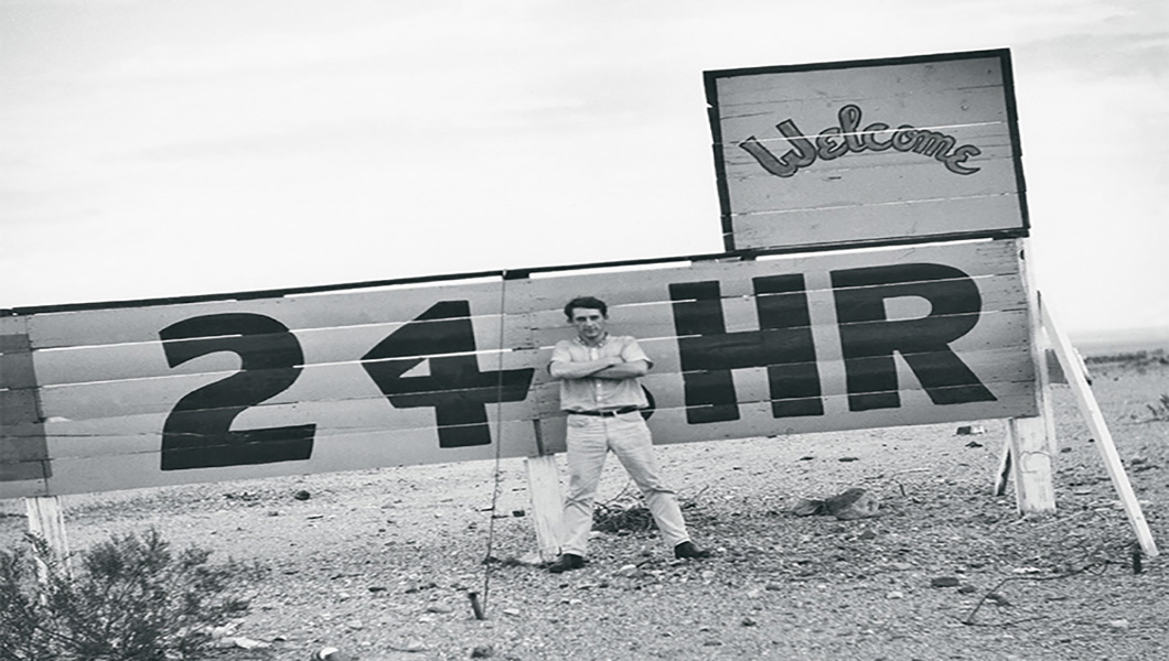
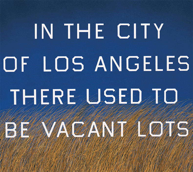
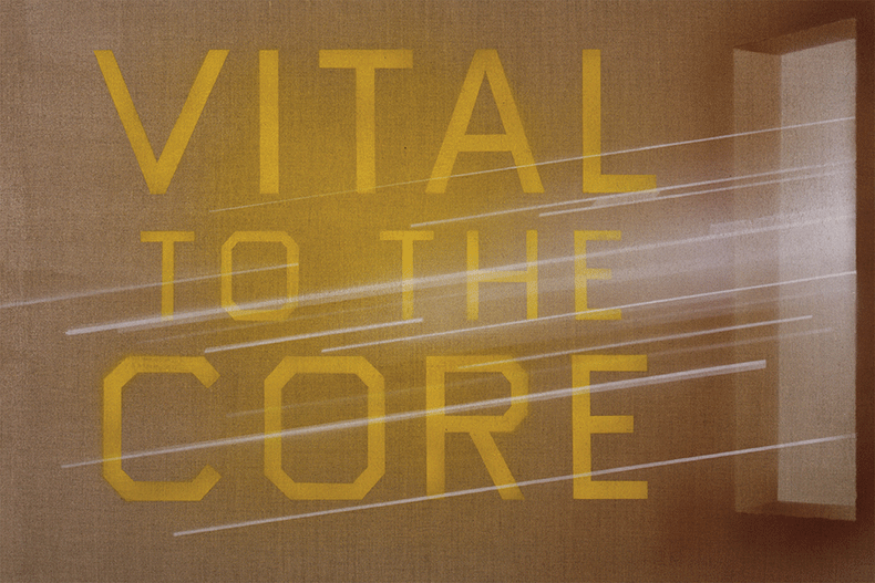
Traveling through Tennessee recently, I could still see the impression legend Clark Byers’ hand-painted SEE ROCK CITY signs have left behind. Some are vinyl knockoffs, but some of the original boards remain, acknowledging the lost Americana art that has suffered against modern printing technology and the bombardment of digital advertising. Artist ED RUSCHA has fond memories of these signs, just as America does for the many similar ones that adorned big businesses and small communities around the country for generations. Ruscha was inspired, and there’s no doubt his body of word paintings are a close relative to the hand-painted sign—his necessity being to communicate an idea rather than something for sale. Of course, art is for sale, so there are comparisons on many conceptual levels. The message is in the hand-painted letters nonetheless. In the 1980s the advent of precise die-cut vinyl lettering and ink-jet printers made the art of necessity cheaper and quicker, but the beauty of the hand-painted symbol has survived. The magic of a hand-painted sign isn’t just in the eye of the beholder; it really lies in the hand of the painter. The perfect brush to pull a line, the optical illusion of letter size, the planned spacing for the optimum read—all these techniques are unique and can’t be replicated by any machine. The human craft of creating one-of-a-kind signage is historic, and though the experienced sign-painter journeyman may be fewer and farther between, the art is alive and well thanks to a resurgence recently in art galleries, books and even as the subject of documentary film. Sign painting is not a science; it’s simply an amazing way to use color and paint to build up letters and words on metal or wood, and it speaks directly to you. Ed Ruscha, like many artists, recognizes this beauty. I was fortunate to have a conversation with him about the art of the hand-painted sign.
What are your earliest memories of seeing hand-painted signs?
I watched a heavyset man squat before a sheet of metal and hand-letter the complete menu for a drive-in hamburger stand in Oklahoma City. He was quick, facile and had everything preplanned. Another time I watched a man do gold-leaf lettering on the translucent glass of my dad’s office door à la Sam Spade. It was for the Hartford Insurance Company.
What attracted you to their craftsmanship?
It was all showmanship, and neither man was distracted by observers. One used matchsticks and toothpicks to correct over painting, while the other used a comb run through his hair for static electricity. These guys were artists!
You had an early interest in typeface in your fine arts career. How did that originate and how did it develop into a fascination with language?
Walking past a bakery always gets the good sniff responses, but in my case it was the aroma of printers’ ink. Especially freshly printed material. It was only a matter of time before I noticed the difference between typefaces.
Do you consider yourself to be a typographer (or a sign painter) since so many of your pieces contain words as the primary subject?
Anyone who makes pictures of words is doing so as though they are carving that word in marble, to make that word solid and last forever. It’s like making a word final and official.
Los Angeles didn’t really have a sign-painting movement like San Francisco or NYC. It really developed here later. We had more neon, oil-based and plastic signs. Do you think there is a connection between sign painting and pinstriping and that could’ve influenced the movement in Los Angeles?
The custom-car culture of Southern California used paintbrush features associated with sign painting, such as pinstriping and embellishments. This set L.A. apart from other sophisticated centers like New York, Chicago and San Francisco.
What is it about the casual look of hand-painted letters that is more appealing than corporate logos?
Handmade letters are more compelling because they are just that: handmade. They call back to the individual rather than a refinement of an industrial idea.
How is the art of optical illusion used in sign painting and why is it important?
Many tricks and devices are used, and in sign painting, these novelties are necessary and, as most sign guys say, “to catch the eye.”
How and why did you adapt that technique in your own artwork?
It’s only coincidental that I lay paint on a surface with a brush like a sign painter. Sign painters might be more “correct” than me since my stuff might be more cerebral.
How does sign painting use color as a necessity?
Again, it’s like that “to catch the eye” concept.
How do you implement your choice of what graphics (ground) vs. graphics (typographic) you use in your word paintings? Do you think that decision is inspired from a sign-painting perspective?
All of us use the ground/subject format. I think about these oldtimers using one-stroke show-card lettering. They get results I envy for.
Is graffiti related to sign painting? How so?
For urgency if not for commerce. These two things might be blood brothers.
How is the psychology of sign painting (in terms of having a very specific purpose) related to the concepts in your word paintings? Is there a connection?
My painting may not sell hamburgers, but I’m aiming for the same high ideals.
Do you have a favorite memory of a hand-painted sign that you really appreciate?
Yes, there was one on the back of a truck in Chickasha, Oklahoma, that said “MELNS 25 CENTS” sitting against a bed full of freshly picked Jubilee melons.
What do you think you would you have done if you weren’t Ed Ruscha the artist?
I would have been Ed Ruscha the meteorologist.
—


